


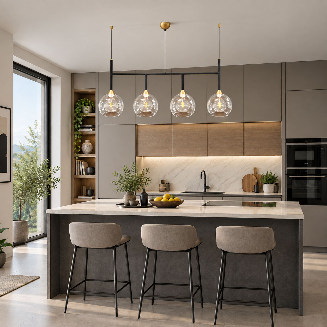
Light isn’t only used to illuminate a space: it helps define its character, changes how we perceive colors, and can affect the feeling we get when we walk into a room. For this reason, when planning a home’s lighting, choosing the right bulb also means considering color temperature.
But how do you choose between warm vs cool light? And what’s the best solution for each room?
The answer depends on how the room is used, the atmosphere you want to create, and the type of activities done there. In this guide we’ll see how color temperature works and how to use it to design balanced, functional lighting.
What is color temperature?
Color temperature indicates the hue of the light emitted by a light source and is measured in Kelvin (K).
Contrary to what it may seem, the lower the Kelvin value, the warmer the light appears; as the temperature increases, the light becomes progressively cooler.
In general, we can distinguish:
- 2700-3000 K: warm light, with tones tending toward yellow and amber.
- 3000-4000 K: neutral light, more balanced and closer to natural light.
- 4000-6500 K: cool light, with white tones or slightly tending toward blue.
These values are a useful reference for understanding home color temperature, but they should not be considered an absolute rule. The choice also depends on materials, wall colors, the amount of natural light, and the desired effect.
Warm vs cool light: what are the differences?
When we talk about warm vs cool light, the main difference concerns how we perceive the space.
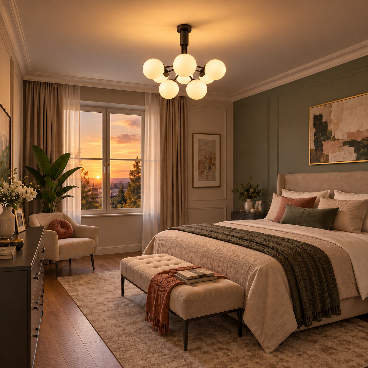
Warm light tends to make spaces more welcoming, intimate and relaxing. It is especially suited to rooms meant for rest and socializing.
Cool light, on the other hand, gives a sharper, more dynamic feel. It can be useful in spaces where it’s important to have a good perception of details and colors.
Between these two extremes, however, there is neutral light, an intermediate solution that is particularly versatile.
Warm light: when to choose it
A temperature around 2700-3000 K may be suitable for:
- living room;
- bedroom;
- dining room;
- relax corners;
- decorative lighting.
Warm light enhances materials such as wood, fabrics and surfaces in beige, cream and terracotta tones, helping to create a soft, enveloping atmosphere.
Cool light: when to choose it
Higher temperatures, generally from 4000 K upwards, can be used in settings where greater definition and focus are needed, such as:
- garages and cellars;
- some work areas;
- utility rooms;
- commercial or professional spaces.
That doesn’t mean, however, that cool light is automatically more functional. An excessively high temperature can feel less harmonious in a home environment designed for relaxation.
Neutral light: the compromise for the home
Between warm and cool light there is a third option: neutral light, generally between about 3000 and 4000 K.
It is an interesting choice when you want versatile lighting, able to keep good visual rendering without overly changing the perception of the space.
It can be suitable, for example, for:
- kitchen;
- bathroom;
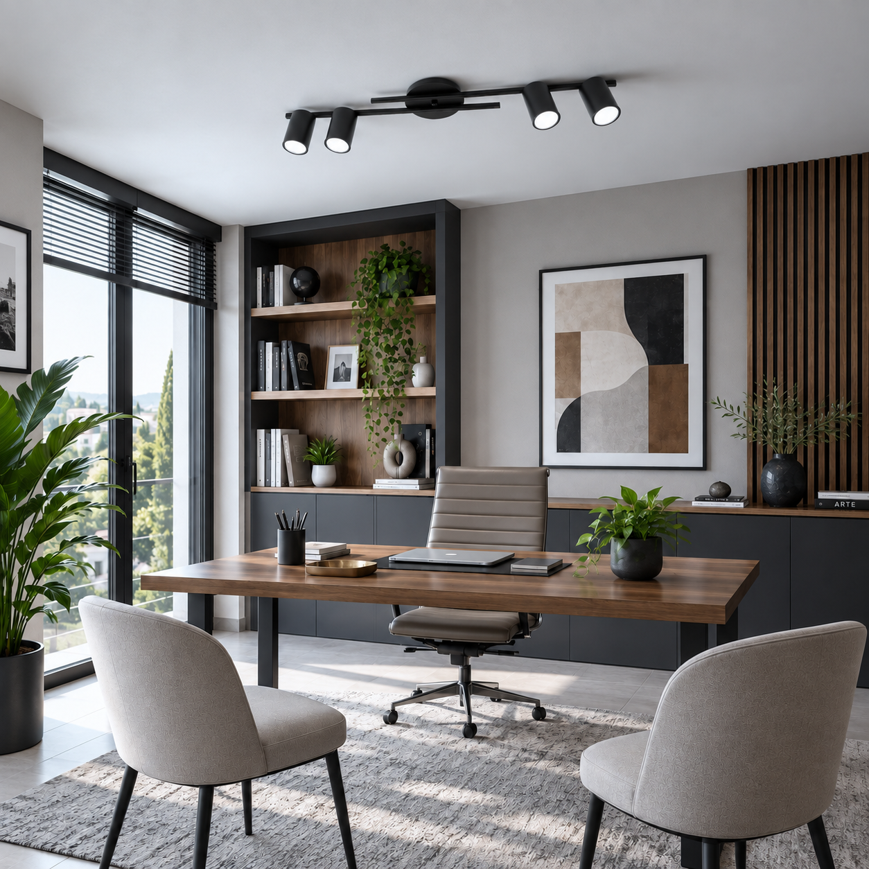
- study;
- hallways;
- entryways.
In a modern kitchen, for instance, neutral light can help you distinguish colors and surfaces more easily while preparing food, while still keeping a natural look.
Home color temperature: which one to choose room by room?
There is no ideal color temperature for the whole home. Effective design starts from the specific use of each room.
- Living room
The living room is a multifunctional space: you chat, read, watch TV and relax.
A warm light, around 2700-3000 K, is often suitable for general and decorative lighting. For reading or work areas you can add more focused light points, possibly with a slightly more neutral temperature.
- Bedroom
In the bedroom the goal is generally to create a relaxing environment. For this, a warm light between 2700 and 3000 K can help achieve a more intimate atmosphere.
Bedside lamps, wall lights and indirect light points can be used to avoid lighting that is too even and intense.
- Kitchen
The kitchen requires a good balance between atmosphere and functionality.
A temperature roughly between 3000 and 4000 K can be a versatile solution. It is also important to light worktops directly, preventing the general light from casting shadows on working surfaces.
- Bathroom
In the bathroom the light must be functional, especially in front of the mirror.
A neutral temperature, roughly between 3000 and 4000 K, can offer a fairly natural perception. For the mirror it is also important to consider the position of the light sources: side lighting or evenly distributed light can reduce shadows on the face.
- Study and home office
In a space intended for work or study it is essential to find a balance between visual comfort and good detail perception.
A neutral light can be a versatile choice. More than simply increasing the color temperature, it is important to make sure the workstation is lit evenly and without annoying reflections on the screen.
It’s not just about temperature: watch the lumens
When choosing a light bulb, color temperature is not the only parameter to consider.
It is important to distinguish between Kelvin and lumens:
- Kelvin (K) indicate the shade of the light;
- lumens (lm) indicate the amount of light emitted.
A 3000 K bulb is not necessarily more or less bright than a 4000 K one: the two values describe different features.
To properly design a space, you must therefore consider at the same time the amount of light, distribution, color temperature, and the characteristics of the space.
Color rendering also makes the difference
Another important parameter is the color rendering index (CRI or Ra), which indicates how faithfully a light source allows colors to be perceived compared to a reference source.
A high CRI is especially important in spaces where color perception plays a key role, such as the kitchen, bathroom, walk-in closet or make-up areas.
For a home, choosing sources with good color rendering can help achieve a more natural perception of furniture, fabrics, surfaces and objects.
How to create the right atmosphere with light
Lighting design should not rely on a single central light source. A more balanced space comes from combining different lighting levels.
You can distinguish:
- General lighting: provides the amount of light needed to move around and live in the space.
- Task lighting: focuses light on activities, such as reading, cooking or working.
- Accent lighting: highlights architectural elements, paintings, furniture or decorative details.
By combining these three types, you can change the light’s mood throughout the day without having to completely change the room’s lighting.
Warm vs cool light: watch out for interior colors
The same color temperature can produce different effects depending on the setting.
White walls, wood surfaces, stone, marble and colored fabrics interact with light and can change its perception.
A very warm light can bring out yellow and reddish tones, while a cooler light can emphasize blue components more and make some whites look cooler.
For this reason, before choosing the bulbs for good, it helps to look at a sample of the materials directly under the light that will be used in the room.
The most versatile solution? Adjustable lighting
When possible, a particularly flexible solution is to use dimmable light sources or systems that allow you to adjust the color temperature.
This way, the same space can have brighter, more neutral light during daily activities and warmer, softer light in the hours devoted to relaxation.
This flexibility is especially appealing in open spaces and multifunctional environments, where the same room is used for different activities.
In conclusion
Choosing between warm vs cool light doesn’t mean deciding which one is absolutely better. Color temperature is one of the tools used to shape the character of a space.
Warm light can help create cozy, relaxing settings; cool light can offer a sharper, more dynamic feel, while neutral light is a balanced option for many situations.
For a good home color temperature, the advice is to start from the function of each room and assess, together, temperature, intensity, color rendering, light distribution, and the materials present.
The goal isn’t simply to light up: it’s to build the right atmosphere for every moment of the day.
